

When it comes to designing in Elementor, there are many different possibilities straight out of the box. However, sometimes you might desire specific effects or capabilities that require either custom code or additional plugins. One situation I’ve found myself in multiple times was wanting the ability to change the color of text when hovering over its parent container. As it turns out, this can be accomplished fairly easily with a little custom CSS code.
Initial Elementor Setup
First let’s add a container and place a title inside it, like this container below:
Change this text
Adding Custom CSS Classes
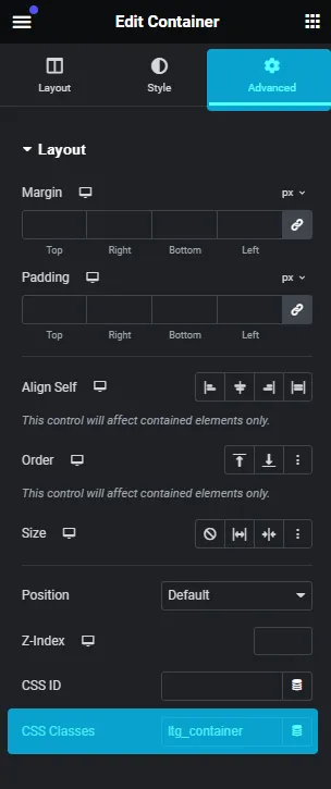
Next, let’s add a CSS class, not including the period, to both the container and the title. For this example we’ll use ltg_container for the container, and ltg_text for the title. To do this, select the element you want to target, then navigate to the “Advanced” Tab within the Elementor sidebar to enter its respective class1.
Make sure that each class you use is unique so you don’t accidentally enact changes elsewhere on your site. It’s also easy to mix up IDs and classes, so double check you’ve entered your class in the correct CSS Classes field.
Adding Custom CSS
Now that we’ve assigned our classes, we’ll be adding them to the custom CSS section of the page. Select the gear in the bottom lefthand corner of the Elementor sidebar, and again, click on the “Advanced” tab.
Since we want the title to change when hovering over the entire container, we’ll need to target a few items: the container, the :hover pseudo-class, and the title. Keep in mind syntax makes or breaks the code, so it should remain in this exact order:
.ltg_container:hover .ltg_text {}
Targeting Specific Elements
For the custom CSS to work, we also need to target the element itself. We’re using an Elementor title with a class of .elementor-heading-title, so we’ll add that class after our custom title class.
From here, we’re ready to add some styling. Let’s add the color that we want the title to change to inside the brackets. We’re using a bright purple color, #7359f9, so our code would look like this:
					.ltg_container:hover .ltg_text .elementor-heading-title {
color:#7619e9;
}
Below is a preview of this simple code in action. As you hover over any area of the container, you’ll notice the text changes color:
Change this text
This code can be easily modified to target any element upon hover over its parent container. It will not work on items that are outside the container. If you are using a different type of element than an Elementor title, you’ll have to locate the element’s class to manipulate it. The best way to find the an element’s class is to use your browser’s inspector feature to inspect the element you are looking to change on the front end.
Using hover effects on other elements
Once we find the class for an element, we can modify them to behave in almost any way we’d like on hover. In the example below, the textbox and button elements change upon hovering over the container in which they are nested:
Box Title
Change this text instead
Box Title
Bonus: Creating our own custom motion hover effects
Now that we know how to target individual elements and change them upon hovering over their containers, we can create some wild effects using CSS. Below are just a few examples of the possibilities this provides.